Transform visual chaos into intentional harmony with a repeatable, principle-based system that works across interiors, fashion, and lifestyle—no design degree required.
Pattern mixing is not a mysterious talent reserved for elite stylists or inherited intuition. It is a learnable language of scale, rhythm, color, and contrast—one that transforms ordinary spaces and wardrobes into deeply personal expressions of confidence and creativity. This guide dismantles the myth of “matching” and replaces it with a structured, adaptable framework used by professionals to create layered, dynamic, and emotionally resonant environments. Whether you’re pairing a vintage floral armchair with geometric pillows, combining stripes and botanicals in a spring outfit, or integrating global textiles into a modern living room, you’ll gain the clarity to make intentional choices—every single time.
Introduction
Walk into any historically significant interior—from a Parisian salon adorned with Toile de Jouy and damask to a Kyoto machiya layered with indigo kasuri and washi paper motifs—and you’ll witness pattern mixing not as decoration, but as cultural storytelling. For centuries, artisans and homemakers worldwide have woven visual narratives through textiles: the intricate ikat of Central Asia speaking to ancestral craftsmanship, the bold chintz of English country houses reflecting historical trade influences, the rhythmic adinkra symbols of Ghana conveying proverbs and values. This practice was never accidental; it was deliberate composition rooted in shared visual principles. Today, algorithm-driven feeds bombard us with fragmented “inspo” shots stripped of context, leaving many feeling paralyzed by the fear of clashing or appearing “too busy.” Yet the core mechanics of successful pattern coordination remain timeless, universal, and deeply accessible. Drawing from established design theory, textile history, and principles of visual perception, this guide reframes pattern mixing as a structured creative process—not a gamble. You’ll move beyond fleeting trends to build a personal visual vocabulary that feels authentic, balanced, and uniquely yours. The goal isn’t perfection; it’s purposeful expression.
The Harmony Blueprint Framework
Forget vague advice like “mix large and small prints” or “stick to three patterns.” These oversimplifications ignore context, intent, and the emotional resonance of design. Instead, adopt the Harmony Blueprint: a five-step architectural system that treats patterns as intentional elements within a cohesive composition. Like building a house, you begin with foundations before adding decorative details. This framework works universally—across living rooms, bedrooms, wardrobes, tablescapes, and digital spaces—because it addresses the why behind visual harmony, not just the what. Each step builds logically on the last, creating cumulative confidence. Variations of this methodology appear in design education and professional practice because it transforms subjective uncertainty into objective decision-making. You’ll learn to “read” patterns like a composer reads sheet music: understanding rhythm, contrast, and resolution.
Step 1: Establish Your Foundation Scale
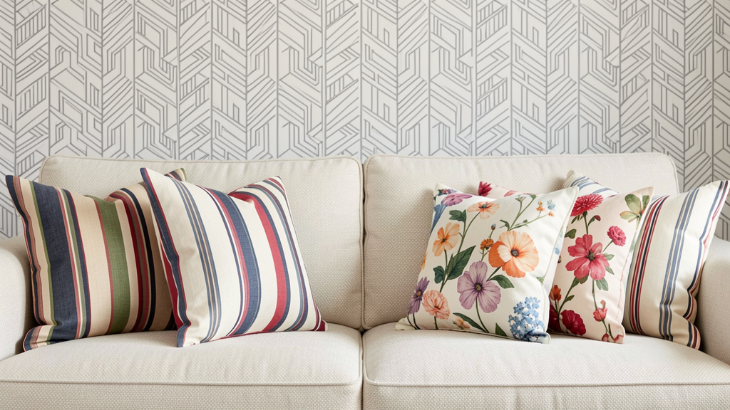
Scale—the relative size of pattern motifs—is the non-negotiable anchor of all successful mixing. Ignoring scale guarantees visual tension, regardless of color or style. Begin every project by identifying your Dominant Scale (the largest repeating element in the space or outfit), then deliberately select supporting patterns at distinctly different scales. This creates visual hierarchy and prevents motifs from competing for attention.
Why this step is crucial: Human eyes instinctively seek order. When patterns of similar scale (e.g., two medium-sized florals) occupy the same visual field, the brain struggles to prioritize, causing discomfort perceived as “clashing.” Varying scales establish rhythm—like bass, midrange, and treble in music—guiding the eye comfortably through the composition. Design principles indicate that environments with clear visual hierarchy can reduce visual stress and enhance spatial perception.
How to do it correctly:
1. Identify your anchor: In a room, this is often the largest textile—area rug, sofa upholstery, or wallpaper. In fashion, it’s the boldest printed piece (a maxi dress, wide-leg trousers, or statement coat). Measure or visually assess its motif size. Is the floral bloom 8 inches wide? Are the geometric shapes spanning 6+ inches? This is your Dominant Scale.
2. Select your Secondary Scale: Choose patterns where motifs are visibly smaller—roughly 1/3 to 1/2 the size of your anchor. For an 8-inch floral rug, select pillows with 2–3 inch motifs (tiny dots, micro-stripes, delicate vines).
3. Introduce your Accent Scale: Add one or two elements with minuscule motifs (under 1 inch): fine pinstripes, subtle herringbone, micro-polka dots, or textural weaves like linen or bouclé that read as “pattern” from a distance but soften up close.
4. Validate with the Squint Test: Step back 6–8 feet. Squint until details blur. Do you see three distinct layers of visual weight? If two patterns merge into visual static, adjust scale immediately.
Real-life example: Consider a vintage Turkish Oushak rug with sprawling botanical motifs serving as the anchor. Harmony can be achieved by layering:
– Secondary Scale: Pillows featuring a smaller-scale ikat pattern (complementary but distinct rhythm)
– Accent Scale: A textured oatmeal bouclé throw (micro-visual interest) and sheer curtains with a barely-there herringbone weave
Result: The composition feels curated, not crowded. The eye travels smoothly from rug to pillows to textures without fatigue.
Common mistakes to avoid:
– The “Medium Trap”: Combining two patterns both labeled “medium scale” (e.g., a standard floral duvet cover with similarly scaled striped curtains). Solution: Intentionally resize one element—swap curtains for a solid with textured weave, or choose a duvet with dramatically larger or smaller florals.
– Ignoring Negative Space: Scale isn’t just about the motif—it’s about the space between motifs. A dense small-scale pattern (like tightly packed polka dots) can feel visually heavy. Counter it with open-scale patterns (wide stripes with generous spacing) or solids.
– Forgetting Vertical vs. Horizontal Perception: Tall, narrow motifs (vertical stripes) read differently than wide, sprawling ones (horizontal geometrics). In narrow rooms, vertical scales enhance height perception; in low-ceilinged spaces, horizontal scales create expansiveness. Adjust accordingly.
Budget-friendly adaptation: Don’t buy new textiles. Repurpose what you have:
– Ideal: Custom-scale pillows ordered to precise measurements.
– Budget: Thrift solid-colored pillows and add iron-on patches in deliberately small-scale patterns (tiny stars, micro-anchors).
– Emergency: Fold a large-scale printed scarf diagonally over a solid pillow—this physically reduces the visible motif size, creating an instant Secondary Scale layer.
Step 2: Curate Your Color Story
Color is the emotional engine of pattern mixing—but it’s rarely about matching hues exactly. Successful coordination hinges on color relationship strategy, not palette replication. This step moves beyond “pick three colors” to teach you how to build intentional color dialogues that feel cohesive even with seemingly disparate prints.
Why this step is crucial: Color carries psychological weight. Warm reds energize; cool blues calm. When patterns share relationships (not identical shades), they create harmony through contrast or resonance. Intentional color relationships are widely recognized in design practice to enhance a space’s cohesion and emotional resonance. More importantly: rigid color matching stifles creativity and ignores the beauty of tonal variation.
How to do it correctly: Choose one of three proven color strategies. Apply it consistently across all patterns:
- Monochromatic Depth: Use one base hue across multiple patterns, varying saturation and value.
- How: Select patterns in the same color family (e.g., navy, powder blue, slate gray) but with different intensities. A deep indigo block-print pillow pairs beautifully with a pale sky-blue watercolor floral and a medium-gray herringbone.
- Why it works: Creates sophisticated, serene cohesion. Ideal for minimalist spaces, bedrooms, or professional wardrobes where calm is prioritized.
-
Pro tip: Introduce one neutral pattern (cream, oat, charcoal) to prevent monotony. A charcoal houndstooth breaks up blue tones without introducing a new hue.
-
Analogous Harmony: Combine patterns using 3–4 colors adjacent on the color wheel (e.g., yellow, yellow-green, green).
- How: Pull one dominant color from your anchor pattern (e.g., sage green in a botanical rug). Select secondary patterns featuring sage plus its neighbors: olive, moss, and butter yellow.
- Why it works: Feels organic and soothing—like colors found together in nature. Perfect for living rooms, kitchens, or spring/summer fashion.
-
Pro tip: Let one color dominate 60% of the composition, another 30%, and accents 10%. This prevents visual equality (which causes chaos).
-
Complementary Contrast: Pair patterns using colors opposite on the wheel (blue/orange, red/green, purple/yellow) for dynamic energy.
- How: If your anchor has terracotta (red-orange), introduce patterns with deep teal (blue-green) accents. Crucially: Mute one or both colors. Use dusty rose instead of hot pink; sage instead of lime green.
- Why it works: Creates vibrancy and focal points. Ideal for dining rooms, creative studios, or statement fashion pieces.
- Pro tip: Use the 80/20 rule. Let your anchor pattern contain 80% neutral (cream, beige, gray) with 20% terracotta. Secondary patterns introduce the complementary teal at low saturation. This prevents visual shouting.
Real-life example: Imagine a vintage kilim rug featuring ruby red, sapphire blue, and saffron yellow. Instead of avoiding color:
– Select a sofa in warm oat (neutral anchor)
– Pillows pull only the ruby red from the rug but in a muted brick tone (monochromatic depth within one hue)
– A throw blanket introduces dusty teal (complementary to ruby) at low saturation
– Curtains in cream with subtle charcoal pinstripe (neutral scale layer)
Result: The vibrant rug becomes the celebrated focal point. Colors feel intentional, not chaotic. Observers often note the “calm energy” of the composition.
Common mistakes to avoid:
– Hue Hunting: Trying to match the exact shade of blue in two different patterns. Natural dyes, lighting, and fabric bases cause variation. Instead, match the relationship (e.g., “both are cool-toned blues”).
– Overloading Primaries: Combining saturated red, blue, and yellow patterns without neutrals. Solution: Desaturate one color (use rust instead of red) or add generous neutral space.
– Ignoring Undertones: A “beige” pillow with pink undertones clashes with a “beige” rug with yellow undertones. Hold swatches side-by-side in natural light. Group warm undertones (yellow, peach) together; cool undertones (pink, gray) together.
Budget-friendly adaptation:
– Ideal: Order fabric swatches to test color relationships in your actual space lighting.
– Budget: Use your smartphone camera. Photograph potential patterns together. Convert the image to grayscale. Do values (light/dark contrast) still work? If yes, color relationships are sound.
– Emergency: Add a unifying layer. Drape a solid-colored throw (in your dominant neutral) over a clashing pillow. Instant cohesion.
Step 3: Balance Pattern Types
Patterns carry inherent visual “weight” and emotional resonance based on their structure. A chaotic abstract feels energetically different than a precise geometric. This step teaches you to categorize patterns by archetype and balance their psychological impact—like composing a meal with appetizer, main course, and dessert.
Why this step is crucial: Pattern archetypes trigger subconscious responses. Geometrics feel modern and orderly; florals evoke nostalgia and softness; organics (marble, wood grain) ground us in nature. Combining too many high-energy archetypes (e.g., bold stripes + chaotic abstract + busy paisley) creates visual tension. Strategic balancing creates rhythm and emotional comfort. Designers use this principle to align spaces with intended use: calming bedrooms (soft florals + organics), energizing offices (clean geometrics + subtle texture).
How to do it correctly: Master these five core archetypes. In any composition, include at least one from Column A (Structured) and one from Column B (Fluid). Limit high-energy archetypes to 1–2 per space.
| Column A: Structured Archetypes | Column B: Fluid Archetypes |
|---|---|
| Geometrics: Stripes, checks, houndstooth, hexagons, Greek keys. Feels: Modern, crisp, intentional. | Florals/Botanicals: Roses, leaves, vines, watercolor blooms. Feels: Romantic, organic, timeless. |
| Repetitive Motifs: Polka dots, quatrefoils, trellis. Feels: Playful, rhythmic, cheerful. | Organics: Marble veining, wood grain, stone texture, brushstrokes. Feels: Earthy, calming, authentic. |
| Abstract Precision: Hard-edged color blocks, optical illusions. Feels: Bold, contemporary, artistic. | Ethnic/Artisanal: Ikat, batik, mud cloth, suzani. Feels: Cultural, textured, soulful. |
Application workflow:
1. Identify your anchor pattern’s archetype (e.g., sofa = large-scale floral → Fluid).
2. Select secondary patterns from Structured column to create balance (e.g., geometric pillow, striped throw).
3. Add one Organic or Artisanal element for depth (e.g., jute rug with visible weave, hand-block printed cushion).
4. Critical nuance: Adjust intensity. A fine pinstripe (Structured) balances a large floral (Fluid) without competing. A bold chevron would overwhelm.
Real-life example: A space featuring dramatic black-and-white damask wallpaper (Structured, high-contrast) initially felt severe when paired with floral pillows. Solution:
– Replaced florals with a textural Organic element: a charcoal bouclé pillow (softens structure without adding visual noise)
– Added a subtle Repetitive Motif: cream pillow with tiny embroidered dots (low-energy Structured element)
– Introduced warmth via Artisanal: a handwoven ochre throw with irregular slubs
Result: The damask remained elegant. The space felt layered and human.
Common mistakes to avoid:
– Archetype Overload: Combining three high-energy Fluid patterns (e.g., large floral + watercolor abstract + busy paisley). Solution: Replace one with a Structured neutral (houndstooth in tonal colors) or solid texture.
– Ignoring Cultural Context: Using culturally specific patterns without understanding meaning. Always research origins. When in doubt, choose patterns inspired by—not directly replicating—cultural textiles, and credit sources if sharing publicly.
– Forgetting Scale Within Archetype: Not all florals are equal. A tight, vintage-inspired rose print feels more Structured than a loose, painterly watercolor bloom. Assess energy level, not just category.
Budget-friendly adaptation:
– Ideal: Source authentic artisanal textiles from ethical makers (supports craftsmanship, adds soul).
– Budget: Thrift solid textiles and add DIY elements. Stencil a subtle geometric border on a plain pillow cover; use fabric markers to add tiny dots to a cream cushion.
– Emergency: Rearrange existing items. Swap a busy floral pillow for a solid textured one. Instant archetype rebalancing.
Step 4: Introduce Texture and Solid Anchors
Texture is the silent harmonizer—the element that makes pattern mixing feel rich rather than loud. Solids are not “boring”; they are essential visual resting places. This step integrates tactile dimension and negative space to prevent fatigue and elevate perceived quality.
Why this step is crucial: Vision is only one sense. Texture engages touch and implied touch (seeing a nubby weave triggers tactile memory). Incorporating varied textures alongside patterns can enhance the sensory experience of a space, contributing to a sense of comfort and authenticity. Solids provide cognitive breathing room. Without them, the eye has nowhere to rest, leading to visual exhaustion—a key reason people abandon pattern mixing. Think of solids as the pauses in music; texture as the instrumentation.
How to do it correctly: Apply the 60-30-10 Texture Rule alongside your color strategy:
– 60% Foundation Textures: Large surfaces with subtle tactile interest (textured plaster walls, oak flooring with visible grain, linen sofa fabric, wool area rug). These should feel neutral but not flat.
– 30% Patterned Textures: Your intentional prints (pillows, curtains, clothing). Ensure their base fabric has character: cotton slub, silk sheen, embroidered details.
– 10% Accent Textures: Small, high-impact tactile elements (a smooth ceramic vase, a nubby bouclé throw, a sleek metal lamp, a chunky knit blanket). These create micro-contrasts that delight the eye.
Critical technique: The Solid Anchor Strategy
Place solid-colored items between patterned elements to create visual buffers:
– In a living room: Solid-colored armchair between two patterned pillows on the sofa.
– In fashion: Solid-colored blazer over a printed dress; solid tote bag with a patterned outfit.
– On a table: Solid placemats under patterned dinner plates; solid napkins with patterned table runner.
Choose solids that pull one dominant color from your patterns (e.g., solid navy pillow pulls blue from a multi-color rug). This creates continuity without competition.
Real-life example: In a space where vibrant patterns felt overwhelming, diagnosis revealed a lack of solid anchors and predominantly flat textures. Solution:
– Replaced flat white bedding with textured oat-colored waffle weave (Foundation Texture)
– Kept one vibrant floral duvet cover but layered it under the waffle weave, peeking only at the edges (Patterned Texture)
– Added solid charcoal throw blanket at foot of bed (Solid Anchor pulling dark tones from floral)
– Swapped flat cotton curtains for linen with visible slub (Foundation Texture)
Result: Patterns felt intentional, not overwhelming. The room gained depth and perceived luxury.
Common mistakes to avoid:
– Flatland Syndrome: Using only smooth, flat-weave fabrics for patterns (e.g., polyester prints on satin). Solution: Prioritize natural fibers (cotton, linen, wool) which inherently carry texture. Even a solid color in linen feels richer than a print on polyester.
– Over-Texturing: Combining too many high-relief textures (shag rug + bouclé sofa + chunky knit pillows). This creates tactile chaos. Balance high-relief textures with smooth elements (silk pillow, glass vase).
– Ignoring Sheen: Matte and shiny surfaces interact with light differently. A silk floral pillow next to a matte cotton stripe can clash due to reflectivity. Group similar sheens together, or use solids to bridge the gap.
Budget-friendly adaptation:
– Ideal: Invest in one high-quality textured solid (e.g., wool throw, linen pillow covers).
– Budget: Thrift solid-colored textiles and enhance texture:
– Dye a plain cotton pillow cover with tea for subtle variation
– Add fringe or tassels to a solid blanket
– Crumple paper, dip in fabric paint, press onto solid fabric for organic texture
– Emergency: Rearrange lighting. Warm, diffused light (lamp with fabric shade) softens textures; harsh overhead light exaggerates them. Add a lamp with a textured shade (woven rattan, pleated paper).
Step 5: Edit with Intention
Editing is not deletion—it is refinement. This final step transforms a collection of patterns into a cohesive statement by applying deliberate constraints. Professionals often spend significant time editing; this is where amateur efforts feel “busy” and expert work feels “curated.”
Why this step is crucial: Cognitive load theory suggests that humans process visual information in chunks. Too many competing elements can overwhelm perception, causing discomfort. Editing reduces noise, amplifies intention, and creates negative space for the eye (and mind) to rest. It’s the difference between a cluttered desk and a thoughtfully organized workspace—both contain tools, but one enables focus.
How to do it correctly: Apply the Three Edit Lenses sequentially:
- The Distance Lens: Stand 10 feet away. What’s the first thing you notice?
- If: Your eye jumps erratically between patterns → Remove or mute the most aggressive element (e.g., swap bold pillow for solid).
- If: One area feels “empty” → Add a small-scale pattern or textured solid to that zone.
-
Pro tip: Take a photo. View it on your phone screen. Small screens compress visual information—clutter becomes obvious instantly.
-
The Story Lens: Ask: “What is this composition saying?”
- Does the mix reflect your intent? (e.g., “calm sanctuary” vs. “energetic creative hub”)
- Do patterns share a subtle connection? (e.g., all inspired by nature; all vintage finds; all handmade)
-
Action: Remove any element that contradicts the story. A corporate-logo polo shirt breaks a “bohemian garden party” outfit story. A sterile geometric pillow undermines a “cozy cabin” room story.
-
The Breath Lens: Identify visual resting places.
- Trace your eye path around the space/outfit. Do you have moments of calm? (Solid walls, neutral floors, plain shoes)
- Rule of thumb: For every patterned element, ensure one solid or low-contrast textured element exists within your line of sight.
- Action: Add a solid anchor if needed (e.g., place a plain ceramic vase between two patterned books on a shelf).
Real-life example: A living room featured a vibrant rug, floral sofa, striped pillows, botanical curtains, and geometric art. Applying the lenses:
– Distance Lens: Eye fixated on clashing curtain stripes and sofa florals.
– Story Lens: The intended story was “mountain lodge meets modern art.” Curtains felt thematically inconsistent.
– Breath Lens: A lack of solid anchors between patterns created visual tension.
Edit: Removed curtains. Added solid charcoal roman shade (pulling dark tones from rug). Swapped one striped pillow for solid textured wool in rug’s accent color. Result: Patterns now felt intentional and aligned with the desired narrative.
Common mistakes to avoid:
– Editing Too Early: Don’t remove elements before establishing all five framework steps. Sometimes perceived “clash” resolves after adding texture or adjusting scale.
– Fear-Based Editing: Removing all patterns due to anxiety. Instead, edit one element at a time. Keep what brings joy.
– Ignoring Context Shifts: A pattern mix perfect for daytime may feel overwhelming at night. Edit lighting first (dimmer switch, warm bulbs) before altering textiles.
Budget-friendly adaptation:
– Ideal: Live with the composition for 48 hours. Take notes on what feels “off.” Edit deliberately.
– Budget: Use removable elements for testing. Clip patterned fabric swatches to pillows; drape scarves over chairs. Edit before committing.
– Emergency: The “One Thing” Rule. Remove the single item that causes the most tension. Often, one edit creates disproportionate harmony.
The Fundamental Principle: Pattern mixing is not about matching, but about creating a visual conversation where each element has a distinct role and voice. Harmony emerges from intentional contrast, not identical repetition.
Applying the Harmony Blueprint Across Contexts
The framework’s power lies in its adaptability. Below, we translate the five steps into specific scenarios—addressing unspoken anxieties and micro-decisions competitors overlook.
Pattern Mixing in Interior Design: Room-by-Room Guidance
Living Rooms: The Social Hub
Living rooms demand balance between hospitality and personality. Common friction: “I want it to feel welcoming, not like a showroom.”
– Scale Strategy: Anchor with area rug (Dominant Scale). Layer sofa texture (Foundation Texture), then pillows at Secondary/Accent scales. Critical nuance: Ensure rug scale relates to room size. In small rooms (<12×12 ft), choose rugs with motifs under 6 inches to avoid overwhelming.
– Color Strategy: Analogous harmony works well for shared spaces (e.g., warm neutrals + olive + terracotta). Pull one color from rug into solid armchair upholstery—this creates a “bridge” solid anchor.
– Archetype Balance: Start with one Fluid pattern (botanical art, floral pillow) + one Structured (geometric rug, striped throw). Add Organic texture (wood coffee table, jute basket).
– Editing Tip: Place solid-colored ottoman between patterned sofa and chairs. It functions as visual breathing space and functional anchor.
– Real friction solved: “My partner prefers minimal patterns.” Compromise: Patterned rug (shared floor) + solid sofa (personal seating) + patterned pillows only on one side of sofa. Respects both preferences.
Bedrooms: The Sanctuary
Bedrooms require calming cohesion. Common friction: “Patterns keep me awake.”
– Scale Strategy: Dominant Scale = duvet cover or headboard fabric. Keep Secondary Scale subtle (pillow shams with tiny motifs). Avoid large-scale patterns on walls directly facing bed.
– Color Strategy: Monochromatic depth in cool tones (lavender to slate) or warm neutrals (oat to clay). Avoid high-contrast complements (red/green) near sleep zones.
– Texture Priority: 70% Foundation Textures. Linen sheets, wool blanket, wood nightstand. Patterned elements should feel soft (watercolor florals, blurred ikat).
– Pro Insight: Place patterned elements below eye level when lying down (pillows, foot of bed). Walls and ceiling should be solid or very subtle texture. This reduces visual stimulation at rest.
– Budget Hack: Dye solid pillowcases with avocado pits for soft pink tones. Layer over white sheets—creates custom monochromatic depth affordably.
Kitchens & Dining Areas: Functional Joy
High-traffic zones need durable, uplifting mixes. Common friction: “Patterns feel impractical with kids/pets.”
– Scale Strategy: Dominant Scale = runner or chair pads. Keep motifs small-scale for easy cleaning (tight geometrics hide stains better than large florals).
– Color Strategy: Analogous warmth (mustard, olive, terracotta) stimulates appetite. Pull one color into solid dinnerware for cohesion.
– Archetype Balance: Structured patterns work well here (checks, stripes)—they feel orderly amid activity. Add Organic texture via wooden bowls, ceramic pitchers.
– Critical Edit: Limit patterns to one surface type. Patterned runner + solid chairs, OR solid table + patterned chair pads. Never both. Prevents visual chaos during meals.
– Real friction solved: “I spill constantly.” Choose performance fabrics (Crypton, Sunbrella) printed with subtle patterns. Or use solid tablecloth with patterned napkins—easy to swap/wash.
Small Spaces & Apartments: Illusion of Expansion
Tiny rooms amplify pattern risks. Common friction: “Patterns will make it feel smaller.”
– Scale Strategy: Dominant Scale must be small. Avoid large motifs on walls/floors. Use vertical stripes on curtains to enhance height perception.
– Color Strategy: Monochromatic light tones (cream to pale gray). Avoid dark complements.
– Texture Trick: Glossy surfaces (glass table, lacquered tray) reflect light, creating perceived space. Pair with one small-scale pattern (micro-dot pillow).
– Editing Non-Negotiable: Max two patterned elements total. Example: Patterned rug + one patterned pillow. Everything else solid/textured neutral.
– Pro Insight: Place patterned items near windows. Natural light diffuses scale, reducing visual weight. Dark corners should remain solid.
Pattern Mixing in Fashion: From Wardrobe to Accessories
Fashion pattern mixing triggers unique vulnerabilities (“Will I look unprofessional?” “Is this age-appropriate?”). The framework adapts seamlessly—scale becomes print size, texture becomes fabric hand, solids become neutral layers.
Foundational Principles for Clothing:
– Scale Translation: Dominant Scale = largest print item (maxi dress, wide-leg pants). Secondary Scale = smaller print (blouse under solid blazer). Accent Scale = micro-print (lining, pocket square).
– The Proportion Rule: Balance visual weight top/bottom. Large-scale print on top? Pair with solid or tiny-print bottom. Bold printed pants? Solid top.
– Solid Anchors Are Essential: Solid shoes, bag, or belt create cohesion. A solid leather belt “grounds” a floral dress and striped top.
– Texture Integration: Pair a silk floral blouse (fluid pattern) with wool houndstooth blazer (structured pattern + texture). The fabric contrast elevates the mix.
Outfit Formulas That Consistently Work:
1. The Professional Anchor: Solid tailored blazer (navy, charcoal, cream) + subtle patterned blouse (micro-dot, fine stripe) + solid trousers. Why it works: Blazer provides structured solid anchor; tiny pattern adds interest without distraction. Ideal for offices.
2. The Casual Harmony: Solid neutral tee + patterned wide-leg pants (botanical print) + solid textured cardigan (chunky knit) + solid leather sandals. Why it works: Tee and sandals create breath space; cardigan adds organic texture bridge.
3. The Statement Balance: Bold printed midi dress (large-scale abstract) + solid structured tote + solid block-heel sandals + tiny patterned scarf (knotted on bag). Why it works: Dress is Dominant Scale; scarf is intentional Accent Scale “echo,” not competition.
4. The Accessory Layer: Solid outfit (black jeans, white tee) + patterned blazer (houndstooth) + solid bag + one patterned accessory (striped silk scarf on neck). Why it works: Accessories become curated accents, not overwhelming elements.
Addressing Common Concerns:
– “Will this look age-appropriate?” Focus on quality fabrics and classic archetypes. A silk polka-dot blouse (Repetitive Motif) with tailored trousers feels sophisticated; cheap polyester print may feel dated. Scale matters: smaller, refined motifs read as intentional.
– “How do patterns interact with my body type?” Use patterns strategically. Vertical stripes can elongate; diagonal patterns (herringbone) create movement. Place bold patterns where you want attention; solids where you want minimization. Confidence is foundational—wear what brings genuine joy.
– “Workplace appropriateness” Know your environment. In conservative settings: limit patterns to one item (blouse, tie) with solid anchors. In creative fields: embrace archetype balance (geometric dress + organic-textured blazer). When uncertain, observe respected colleagues.
Seasonal Adaptations:
– Spring: Analogous color stories (lavender, sage, butter yellow). Light fabrics (linen, cotton). Fluid archetypes (watercolor florals, delicate vines).
– Summer: Monochromatic depth in cool tones (navy to sky blue). Breathable textures (seersucker stripes, eyelet lace).
– Fall: Complementary contrast muted (rust + olive; burgundy + mustard). Rich textures (corduroy stripes, wool houndstooth).
– Winter: Deep monochromatic (charcoal to black) with one warm accent (cream cable knit). Structured archetypes feel cozy (fair isle sweaters, plaid scarves).
Pattern Mixing for Special Contexts
Children’s Rooms: Joyful and Functional
– Scale Strategy: Dominant Scale = removable wall decals or rug. Keep motifs large and clear for cognitive development (big animals, simple shapes).
– Color Strategy: Analogous brights (sky blue, grass green, sun yellow) feel cheerful but not chaotic. Avoid neon complements.
– Critical Edit: Limit patterns to play zones. Sleep area = solid colors + textured neutrals (wool rug, cotton sheets). Creates psychological separation between activity and rest.
– Budget Hack: Use washable fabric paint to add tiny dots or stars to solid pillowcases. Involves kids in creation; easy to refresh.
– Safety Note: Avoid small-scale patterns on crib sheets for infants (can overstimulate). Solid or very large-scale motifs only for under age 2.
Holiday and Seasonal Decor: Festive Without Friction
– The Anchor Method: Choose one seasonal patterned item as Dominant Scale (e.g., Christmas tree skirt with large motifs). Everything else pulls colors/textures from it.
– Example (Thanksgiving): Rust-and-cream buffalo check table runner (Dominant Scale) + solid burnt orange napkins (Solid Anchor pulling color) + tiny-scale leaf-printed place cards (Accent Scale) + wood charger plates (Organic texture).
– Avoid: Combining multiple holiday-specific patterns (plaid + snowflakes + reindeer). Feels thematic, not timeless. Instead, mix one seasonal pattern with year-round textures (linen, wood, ceramic).
– Pro Tip: Store seasonal patterns separately. When decorating, lay all items out. Apply the Distance Lens before hanging/displaying. Edit ruthlessly.
Digital Spaces: Websites, Social Media, Presentations
Pattern mixing principles apply digitally:
– Scale: Headline font size (Dominant), body text (Secondary), icon details (Accent).
– Color: Use analogous palettes for readability; complementary accents for calls-to-action.
– Texture: Subtle gradients, paper textures, or noise overlays prevent flatness.
– Solid Anchors: Ample white space (negative space) is your solid anchor. Critical for reducing cognitive load.
– Edit: Remove any element that doesn’t serve user intent. Digital clutter increases bounce rates. Test with grayscale view—does hierarchy remain clear?
Navigating Common Frictions and Creative Constraints
Even with a framework, real-world constraints arise. This section addresses the hidden anxieties and practical hurdles competitors gloss over—transforming obstacles into opportunities for deeper creativity.
“I Inherited a Beloved Patterned Item That ‘Clashes’ With Everything”
This is a deeply common and emotionally charged friction. That floral armchair isn’t “wrong”—it’s a story waiting for context. Professionals reframe “clashing” as “unintegrated.”
Step-by-Step Integration Protocol:
1. Isolate the Anchor: Place the item alone in the space. Photograph it. Identify its Dominant Scale, color story, and archetype.
2. Extract One Element: Choose one color, scale, or motif to carry forward. Example: Armchair has large pink roses on cream. Extract cream as your neutral anchor color.
3. Build Bridges:
– Introduce a solid textile in that extracted color (cream throw pillow)
– Add a Secondary Scale pattern using only the extracted color + new neutral (e.g., cream pillow with tiny gray dots)
– Incorporate texture that echoes the item’s era (e.g., velvet pillow if armchair is vintage)
4. Edit Thoughtfully: Remove competing patterns. Let the heirloom be the focal point.
Real case: A cherished 1970s orange-and-brown geometric sofa initially felt disconnected. Solution:
– Extracted brown as anchor neutral (not orange)
– Added solid chocolate leather ottoman (Solid Anchor)
– Introduced Secondary Scale: Cream pillow with subtle brown herringbone (Structured archetype balancing sofa’s bold geometry)
– Added Organic texture: Jute rug, wood side table
Result: Sofa felt intentional and integrated. The space honored its history while feeling contemporary.
“I’m on a Tight Budget—Can I Really Mix Patterns Without Buying Everything New?”
Absolutely. Pattern mixing thrives on curation, not consumption. Constraints often spark the most creative solutions.
The Thrifter’s Framework:
– Phase 1: Audit. Lay out all solid-colored textiles (pillows, throws, curtains). These are your future anchors.
– Phase 2: Hunt with Intent. At thrift stores, search only for:
– One Dominant Scale item (large rug, duvet cover) in a color pulled from your solids
– One Secondary Scale item (pillow cover) with motifs 1/3 the size
– Ignore anything that doesn’t fit scale/color strategy
– Phase 3: Transform.
– Dye faded solids to unify colors (fabric dye offers color matching guides)
– Cover stained pillow inserts with thrifted fabric + iron-on hem tape (no sewing)
– Use fabric paint to reduce scale: Paint over parts of a large floral to create negative space, effectively making motifs smaller
– Pro Insight: Imperfections add character. A slightly faded vintage floral has more soul than a perfect new print. Lean into patina.
DIY Texture Boosters (Under $10):
– Fringe: Cut strips of fabric, knot onto solid pillow edges
– Embroidery: Hand-stitch simple running stitches in contrasting thread on solid linen
– Dip-Dye: Dip bottom third of solid curtains in diluted dye for ombre effect
– Stenciling: Use cardboard cutouts + fabric paint to add tiny-scale motifs to solids
Remember: A single well-placed patterned element (one vintage kilim pillow on a solid sofa) creates more impact than ten mismatched cheap prints. Quality of integration > quantity of patterns.
“I’m Visually Overwhelmed Just Thinking About This”
This is valid and common. Pattern anxiety often stems from decision fatigue or past negative experiences. Start microscopically.
The 5-Minute Pattern Confidence Builder:
1. Today: Find one solid-colored item you love (a mug, a book cover, a shirt).
2. Tomorrow: Place one small patterned item next to it (a coaster with tiny dots, a bookmark with stripes).
3. Observe: Do they feel harmonious? Why? (Likely: scale contrast + shared color).
4. Celebrate: You just successfully mixed patterns.
Progressive Exposure Plan:
– Week 1: Add one patterned element to a solid space (patterned tea towel in kitchen)
– Week 2: Add a second element that shares one attribute with the first (same color family, smaller scale)
– Week 3: Introduce texture (woven basket next to patterned items)
– Week 4: Edit one item that feels “off”
This builds neural pathways for visual confidence. Track progress in a journal: “Today I paired my striped socks with solid shoes. Felt good.” Small wins rewire anxiety into agency.
Cultural Sensitivity and Ethical Pattern Mixing
Patterns carry cultural significance. Using them respectfully is essential.
Essential Guidelines:
– Research Origins: Before using patterns like Navajo motifs, Adinkra symbols, or Aboriginal dot art:
– Who created this? What does it represent?
– Is it sacred or ceremonial? (If yes, avoid decorative use)
– Are contemporary artisans from that culture profiting from its sale?
– Prioritize Ethical Sourcing: Buy directly from cultural artisans via platforms like Etsy (filter “handmade,” verify shop location), Ten Thousand Villages, or Fair Trade Federation members. Confirm fair wages and cultural respect.
– When in Doubt: Choose patterns inspired by rather than direct copies. Example: “Geometric weave inspired by West African textiles” vs. replicating a specific sacred symbol. Credit inspiration if sharing publicly.
– Amplify Voices: Follow and support designers from cultures whose patterns you admire. Share their work.
This isn’t restriction—it’s deepening connection. Learning that a Guatemalan huipil pattern tells a village’s story transforms it from “pretty print” to meaningful object. Honor the hands that made it.
When to Break the Rules (Intentionally)
Mastery includes knowing when to deviate. Rule-breaking must be deliberate, not accidental.
Valid Reasons to Break Framework Rules:
– Artistic Statement: An installation meant to provoke (e.g., clashing scales to evoke chaos in a gallery). Intent is clear.
– Personal Joy: If a “rule-breaking” combination sparks genuine delight for you, and you’ve consciously accepted the visual tension, wear/display it proudly. Your home, your rules.
– Historical Accuracy: Restoring a period room may require era-appropriate pattern density. Context justifies the mix.
How to Break Rules Skillfully:
1. Break only one rule at a time (e.g., similar scales but monochromatic colors).
2. Compensate elsewhere (add extra solid anchors if breaking scale rule).
3. Name your intent: “I’m using clashing scales here to reflect the room’s playful purpose.”
4. Test with trusted eyes: “Does this feel intentional or accidental to you?”
It is advisable to understand the underlying principles before intentionally deviating from the framework. Break rules from informed choice, not uncertainty. The framework gives you the foundation to rebel meaningfully.
Your Questions, Answered
Q: How many patterns is too many?
A: There’s no universal number. Apply the Breath Lens: Can your eye rest comfortably? In a large living room, five well-integrated patterns (rug, two pillows, art, throw) may feel serene. In a small entryway, two might feel busy. Prioritize integration quality over quantity. If removing one element improves harmony, it was too many.
Q: Can I mix patterns with the same colors but different scales?
A: Absolutely—and this is often the safest starting point. A large-scale navy floral rug paired with a small-scale navy stripe pillow creates sophisticated monochromatic depth. Ensure scales are distinctly different (not two “medium” prints). Add a textured neutral (cream bouclé pillow) to prevent flatness.
Q: What if my patterns share a color but it’s a different shade (e.g., one has royal blue, another has navy)?
A: This is normal and often desirable. Natural variation adds authenticity. Validate using the grayscale test: Photograph both patterns together, convert to black-and-white. If their values (light/dark contrast) harmonize, the color relationship works. If one disappears or clashes in grayscale, adjust.
Q: Are there patterns that should never be mixed?
A: Avoid combining two high-contrast, high-energy patterns of similar scale and archetype (e.g., bold red-and-black zebra print + equally bold red-and-black leopard print). They compete for dominance. Instead, pair one bold animal print with a structured neutral (houndstooth in tonal colors) or solid texture. Context matters: In fashion, this combo might be a deliberate statement; in a serene bedroom, it likely causes tension.
Q: How does lighting affect pattern mixing?
A: Significantly. North-facing rooms (cool light) mute warm colors; south-facing (warm light) intensifies them. Always evaluate patterns in the actual space at different times of day. Solution: Choose patterns with inherent depth (textured weaves, multi-tonal prints) that adapt to lighting. Avoid flat, single-hue prints in variable light.
Q: I’m colorblind—can I still mix patterns successfully?
A: Yes. Rely on scale, texture, and value (light/dark contrast). Use smartphone apps like Colorblind Assistant to identify hues. Focus on archetype balance (geometric + floral) and texture variation. Enlist a trusted friend for initial color validation, then build confidence through scale/texture editing. Many accomplished designers navigate colorblindness successfully—they excel through structural mastery.
Q: How do I mix vintage and modern patterns without it looking dated?
A: Bridge eras through shared elements. A vintage floral (soft colors, organic shapes) pairs beautifully with a modern geometric if they share:
– A common color (pull the cream background from vintage into modern print)
– Complementary scale (large vintage floral + small modern dot)
– Unifying texture (linen for both)
Place them near each other with a solid anchor between (e.g., vintage pillow + solid cushion + modern pillow). The solid creates intentional separation.
Q: What’s the quickest fix if patterns are clashing after setup?
A: The Solid Anchor Intervention. Immediately add one solid-colored item that pulls a dominant color from the clashing patterns. Examples:
– Drape a solid throw blanket over the back of a patterned sofa
– Place a solid-colored tray on a patterned coffee table
– Swap one patterned pillow for a solid in a shared color
This creates instant visual breathing room. Most perceived “clashing” resolves with this single edit.
Q: Can pattern mixing work in minimalist or Scandinavian interiors?
A: Absolutely—but with restraint. Minimalism isn’t “no patterns”; it’s “only meaningful patterns.” Choose one Dominant Scale item with subtle texture (a rug with barely-there herringbone). Keep all other textiles solid but rich in texture (undyed wool, raw linen). The pattern becomes a quiet focal point, not visual noise. Scandinavian design often uses small-scale naturals (wood grain, subtle stripes) for warmth within simplicity.
Q: How do I teach my kids to appreciate pattern mixing without chaos?
A: Frame it as visual storytelling. “This pillow has tiny stars (point to Accent Scale). This rug has big mountains (Dominant Scale). They’re friends on an adventure!” Use the Squint Test as a game: “Can you see three layers?” Start with their clothing: Solid jeans + striped tee + tiny-dot socks. Celebrate their choices. This builds visual literacy organically.
Q: Are there tools or apps to help visualize pattern mixes before buying?
A: Yes. Apps like Canva (upload fabric photos, layer digitally), Sherwin-Williams ColorSnap Visualizer (test color relationships), or even PowerPoint (drag images together) help simulate mixes. For physical testing: Order fabric swatches (many online retailers offer low-cost samples). Arrange them on your sofa/floor in natural light. The small investment prevents larger mistakes.
Q: What if I follow all steps and still feel uncertain?
A: Trust your emotional response over rigid rules. Sit quietly in the space or wear the outfit. Ask: “Does this feel like me? Does it bring calm or joy?” If yes, it’s successful. If unease persists, apply the Story Lens: “What story am I telling?” Adjust one element to align with your truth. Confidence grows with practice—your intuition will strengthen.
Conclusion and Your Next Step
Pattern mixing is not a test to pass or a trend to chase. It is a lifelong practice of seeing deeply, choosing intentionally, and expressing authentically. You now hold a framework refined through design history and adapted for modern living—a system that replaces anxiety with agency. Remember the core truth: Harmony arises from thoughtful contrast, not perfect matching. The slight variation in a hand-blocked print, the whisper of texture in a linen weave, the deliberate pause of a solid anchor—these are not flaws. They are the marks of humanity in a curated life.
Recap: The Three Pillars of Fearless Pattern Mixing
- Scale is Sovereign: Always establish Dominant, Secondary, and Accent scales first. This alone resolves most perceived “clashing.”
- Relationships Over Replication: Build color stories through monochromatic depth, analogous harmony, or muted complementary contrast—not exact hue matching.
- Edit with Empathy: Apply the Distance, Story, and Breath Lenses to refine with purpose. Remove to reveal, not to diminish.
The 24-Hour Rule: Your Tiny, Transformative Action
Within the next 24 hours, complete this single step:
👉 Place one solid-colored item (a book, a vase, a folded blanket) between two patterned objects in your home.
Observe the shift. Notice the breathing room. Feel the intention. This micro-edit proves you already possess the power to create harmony. No purchases required. No perfection demanded. Just one deliberate choice.
The Big Picture: Patterns as Personal Language
Every pattern you choose whispers a fragment of your story—the vintage rug echoing travels, the heirloom quilt honoring lineage, the bold geometric reflecting modern spirit. When you mix with intention, you compose a visual poem only you can write. This practice extends beyond aesthetics: it cultivates patience, discernment, and the courage to embrace beautiful imperfection. In a world of mass-produced uniformity, your thoughtfully layered space or outfit becomes a quiet act of authenticity—a testament to a life lived with attention and heart. Start small. Trust the process. Your unique visual voice is waiting to be heard.
Explore Our Complete Design System:
The Texture Layering Method: Adding Depth Without Clutter | Color Confidence: A Science-Backed Guide to Palette Building | The Intentional Home Audit: 7 Questions to Align Your Space with Your Values | Sustainable Styling: Ethical Sourcing for Conscious Consumers | The Wardrobe Edit: Building a Capsule That Celebrates Your Body | Lighting Alchemy: Transforming Mood and Space with Light Layers | The Art of Display: Curating Shelves That Tell Your Story